Evolving an Organic Brand for Its Fast-Food Debut
Evolving an Organic Brand for Its Fast-Food Debut
Evolving an Organic Brand for Its Fast-Food Debut
Laalu Chacha began over a decade ago as a provider of organic chicken and dairy in Islamabad. As the market shifted and sourcing truly organic products became difficult, the brand pivoted to event-based food pop-ups-quickly becoming a hit thanks to its high-quality ingredients and creative fast-food offerings.
But Laalu was still using its original identity, designed years earlier by our own Design Director. Redesigning your own work is a unique challenge-balancing respect for the past with the needs of a very different future.
The client wanted something bold and modern, a brand that reflected Laalu's evolution and its new direction.
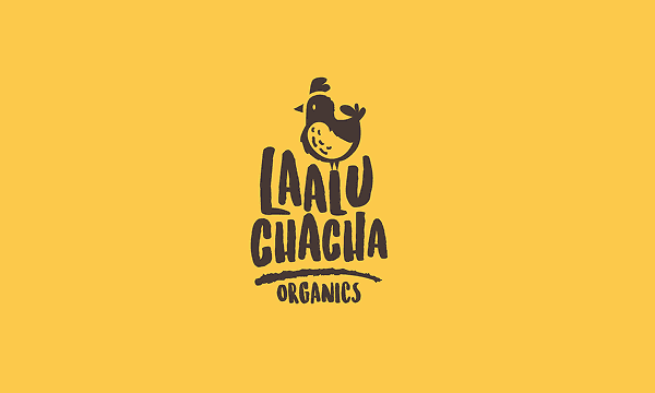
Previous Logo
Previous Logo
Previous Logo
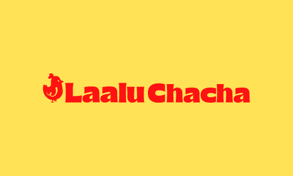
New Logo
New Logo
New Logo

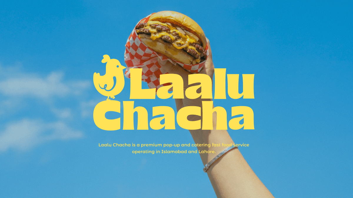
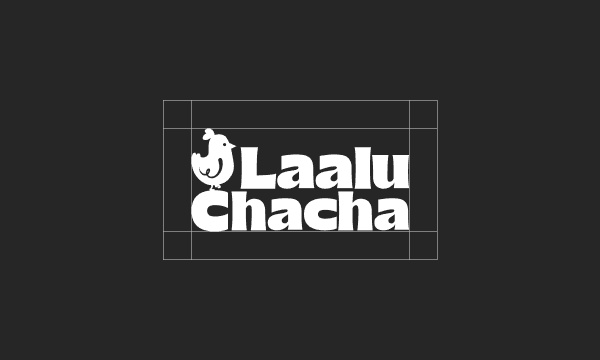
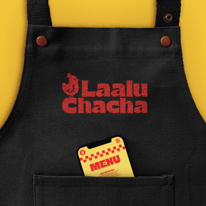
The Logo
The Logo
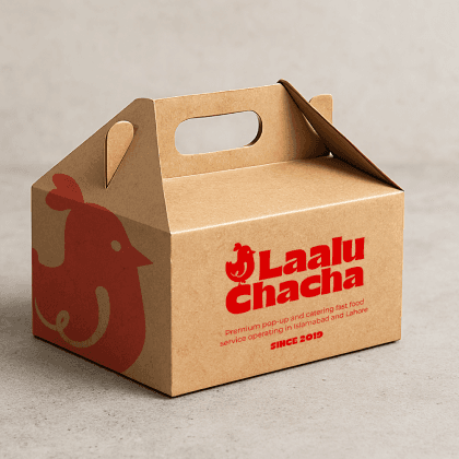
The Laalu Chacha logo exudes a vibrant, friendly, and authentic vibe that breaks away from the monotony of typical fast-food chains. It’s a symbol of fun and originality, instantly catching the eye and inviting customers to indulge in a memorable dining experience. Atop the logo stands Chirpy, the lovable and chubby chicken mascot, proudly welcoming patrons with open wings and a cheerful spirit.
The Laalu Chacha logo exudes a vibrant, friendly, and authentic vibe that breaks away from the monotony of typical fast-food chains. It’s a symbol of fun and originality, instantly catching the eye and inviting customers to indulge in a memorable dining experience. Atop the logo stands Chirpy, the lovable and chubby chicken mascot, proudly welcoming patrons with open wings and a cheerful spirit.
The Laalu Chacha logo exudes a vibrant, friendly, and authentic vibe that breaks away from the monotony of typical fast-food chains. It’s a symbol of fun and originality, instantly catching the eye and inviting customers to indulge in a memorable dining experience. Atop the logo stands Chirpy, the lovable and chubby chicken mascot, proudly welcoming patrons with open wings and a cheerful spirit.


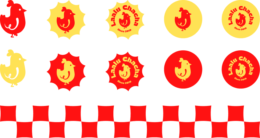
Logomark, Labels and Pattern
Logomark, Labels and Pattern
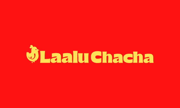
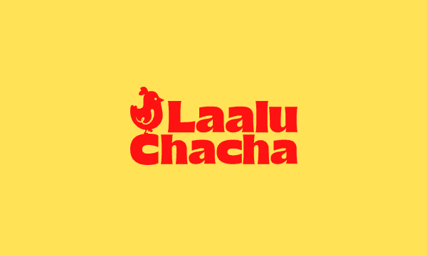
Colour and Type
Colour and Type
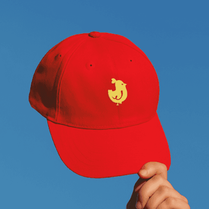
Yellow and Red serve as the brand’s primary colours, radiating energy and warmth. Yellow is used mainly as a background colour and Red as the colour of the logo. These can be inverted if needed. Secondary colours are Black and White and can be used where Red or Yellow do not work.
Yellow and Red serve as the brand’s primary colours, radiating energy and warmth. Yellow is used mainly as a background colour and Red as the colour of the logo. These can be inverted if needed. Secondary colours are Black and White and can be used where Red or Yellow do not work.
Yellow and Red serve as the brand’s primary colours, radiating energy and warmth. Yellow is used mainly as a background colour and Red as the colour of the logo. These can be inverted if needed. Secondary colours are Black and White and can be used where Red or Yellow do not work.


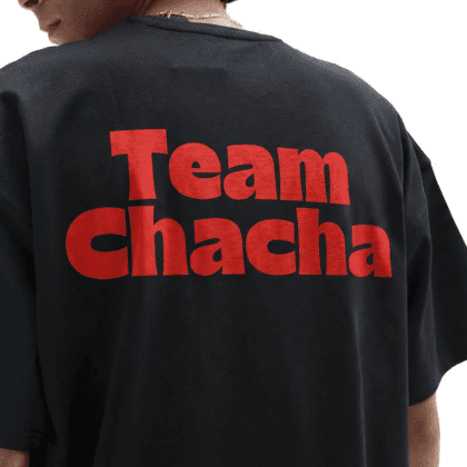
Brand Personality
Brand Personality
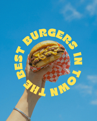
Laalu Chacha is a bold, flavor-forward fast food brand. With its playful name, punchy colours, and a cheeky chicken mascot, Laalu Chacha taps into Gen Z’s craving for authenticity, nostalgia, and meme-worthy moments. The brand’s visual identity is rooted in vibrant red-and-yellow palettes, chunky retro typefaces, and loud imagery delivering serious street food vibes with a fun, irreverent twist.
Laalu Chacha is a bold, flavor-forward fast food brand. With its playful name, punchy colours, and a cheeky chicken mascot, Laalu Chacha taps into Gen Z’s craving for authenticity, nostalgia, and meme-worthy moments. The brand’s visual identity is rooted in vibrant red-and-yellow palettes, chunky retro typefaces, and loud imagery delivering serious street food vibes with a fun, irreverent twist.
Laalu Chacha is a bold, flavor-forward fast food brand. With its playful name, punchy colours, and a cheeky chicken mascot, Laalu Chacha taps into Gen Z’s craving for authenticity, nostalgia, and meme-worthy moments. The brand’s visual identity is rooted in vibrant red-and-yellow palettes, chunky retro typefaces, and loud imagery delivering serious street food vibes with a fun, irreverent twist.
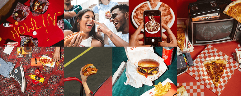
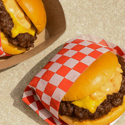
Brand in Action
Brand in Action


Social Media
Social Media